Liquid Light

Identity Branding, Logos, Print

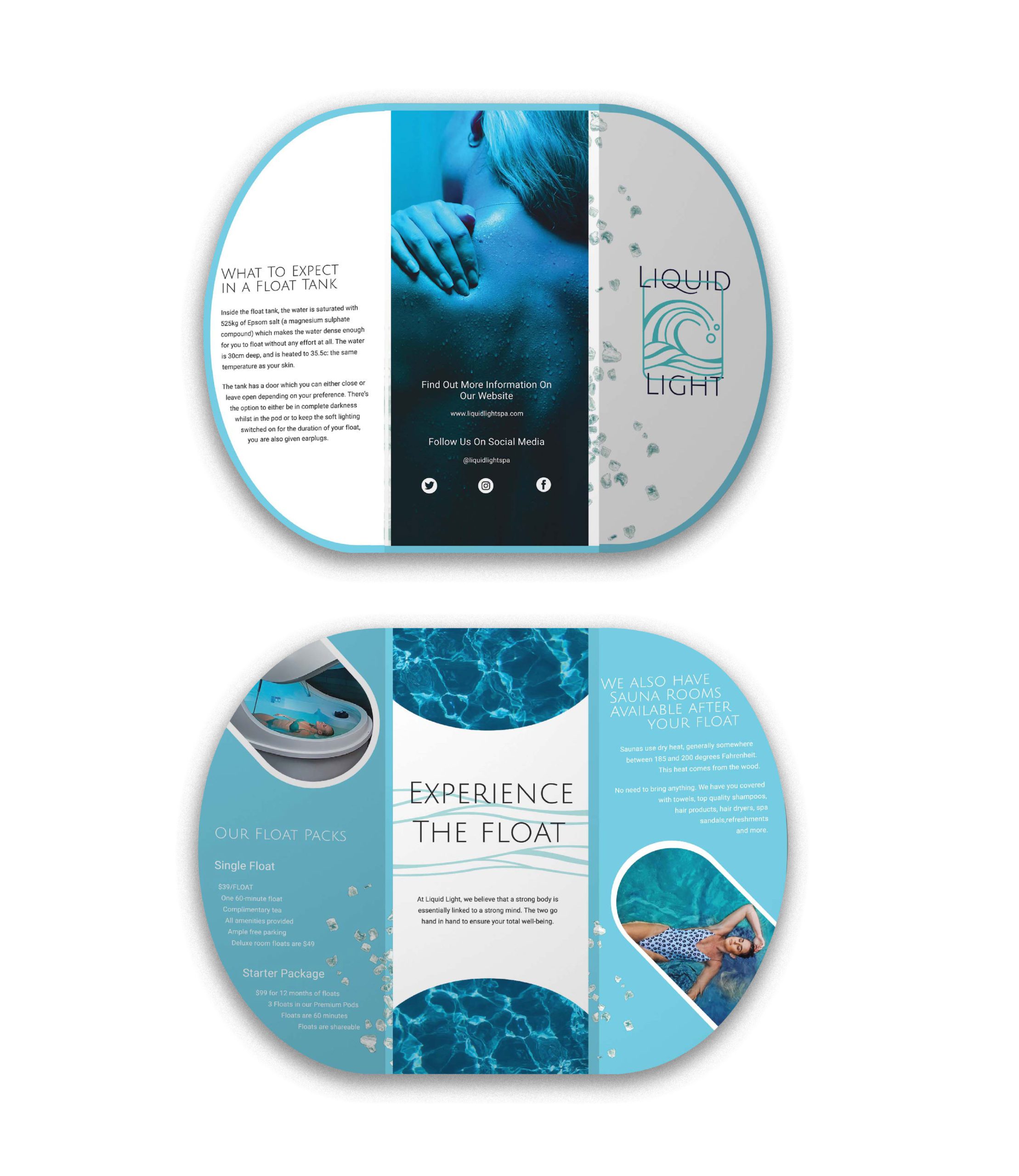
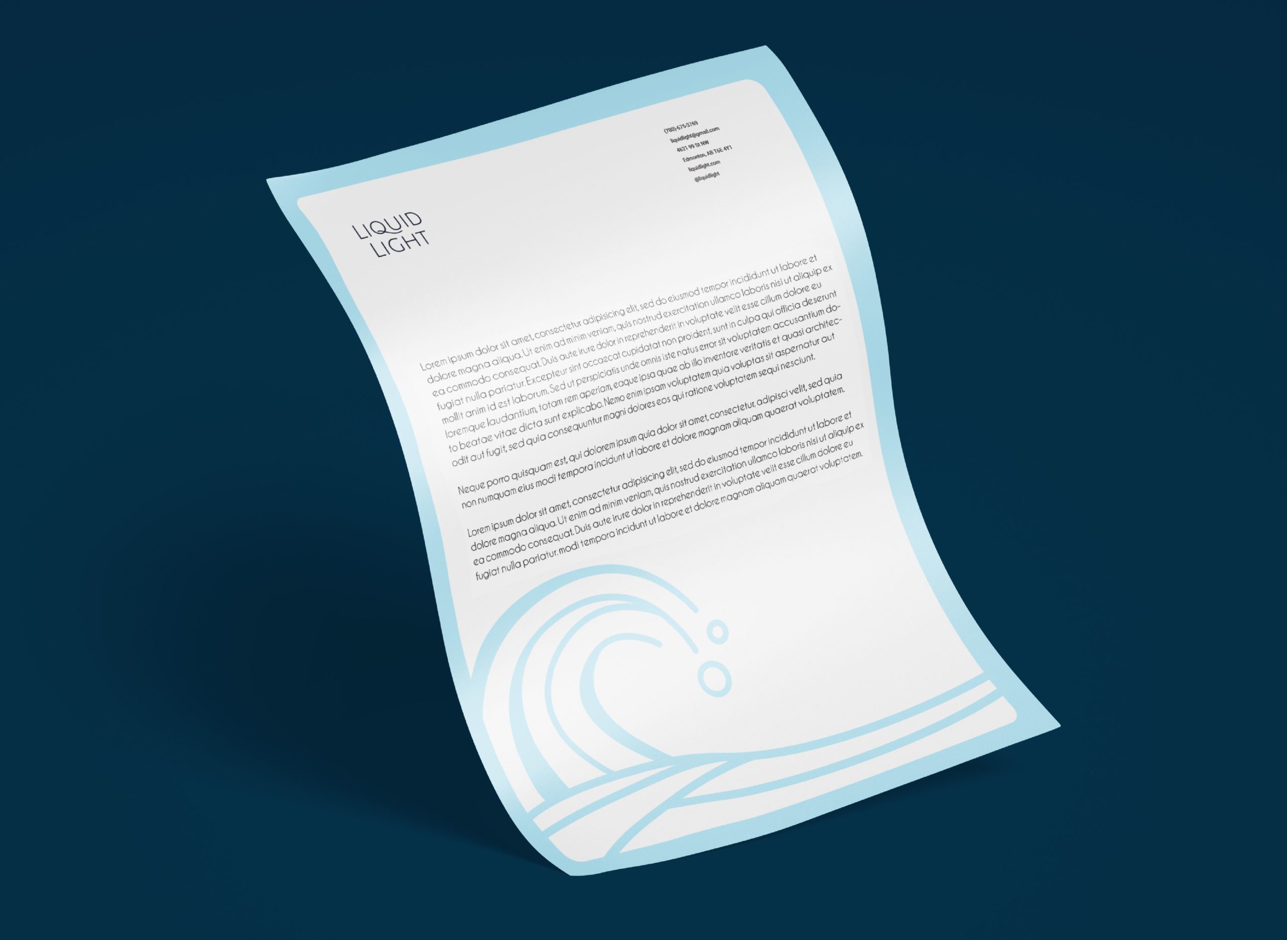
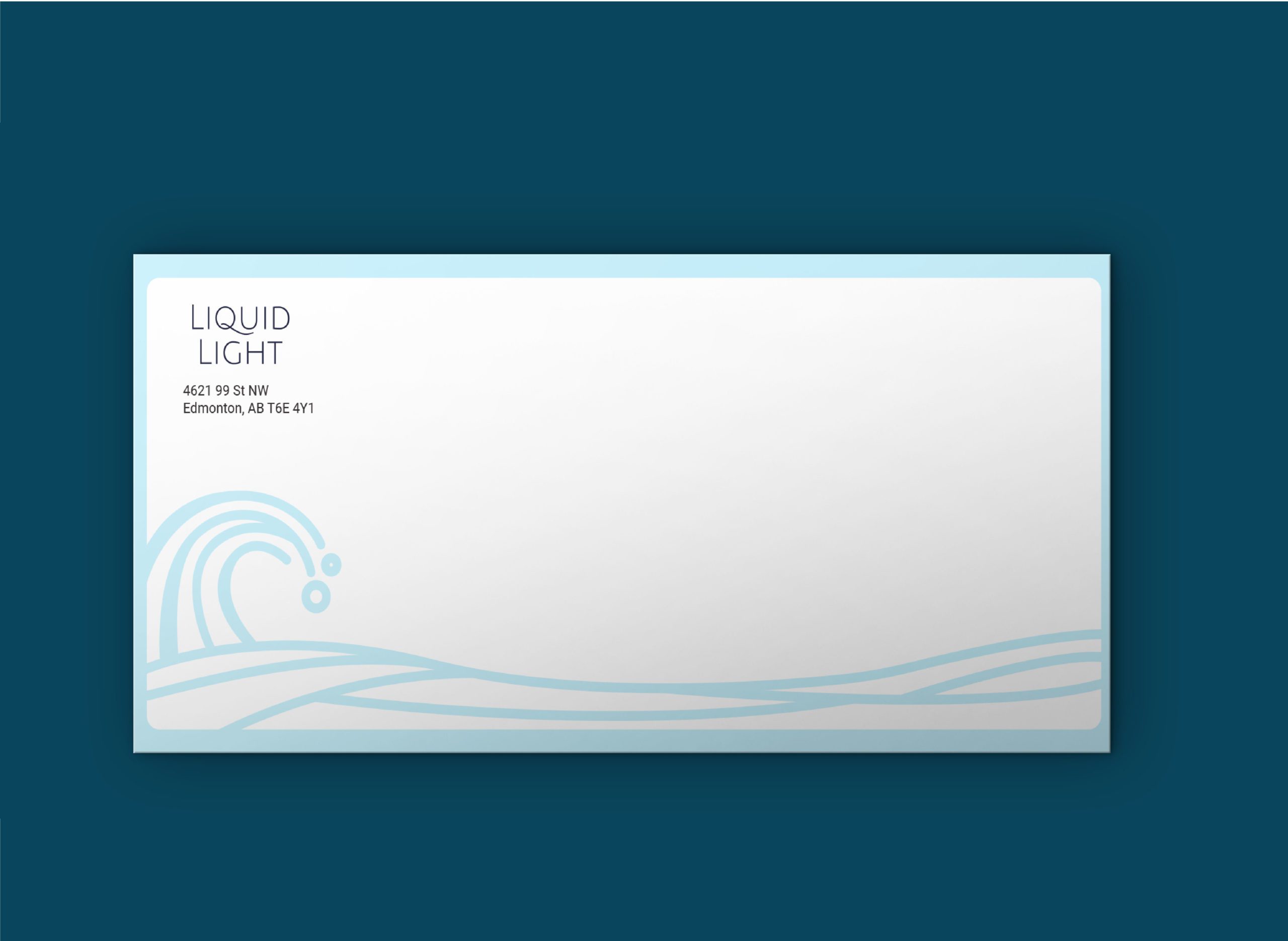
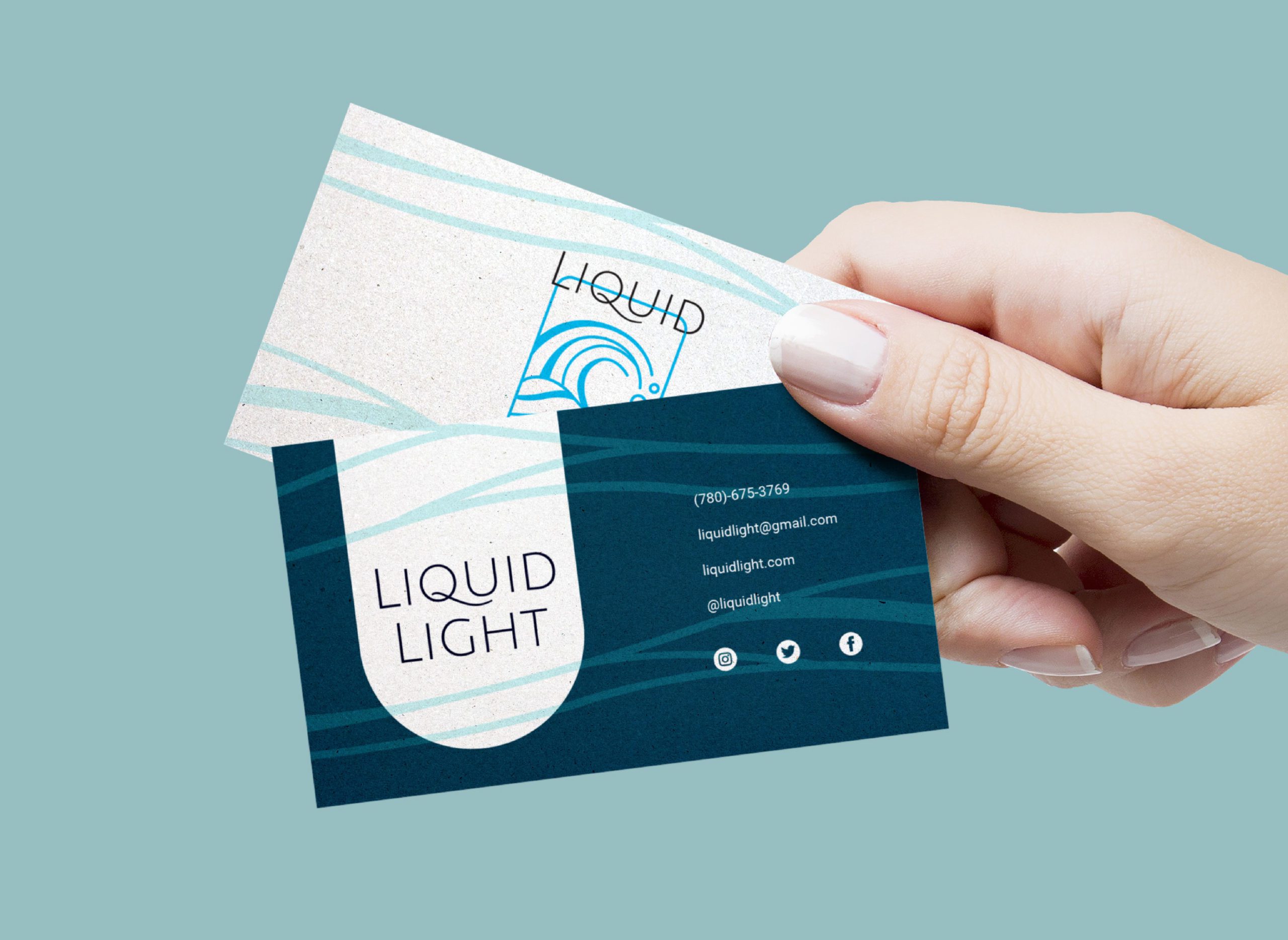
This project entailed creating a brand for a spa. Liquid Light is a spa that specializes in float tanks. I created a brochure that included making dielines and embellishments that would emphasize the brand. The logo on the front would have a nice glossy finish and the cut is to resemble a float tank when the brochure is folded out. It’s nice and simple to not take away from the information. This project allowed me to have first hand experience in proper file set up and managing said dielines and embellishments. The use of the symbol mark on the envelope and letterhead would bring the branding across all assets as well as add interest. The business cards would have a matte finish with the logo having a glossy finish.

illustrated green flower
illustrated lime green flower used for decoration
illustrated green flower
illustrated lime green flower used for decoration

Doing What I Do Best!

Packaging
Illustrated bee in a box used for packaging
Illustration
Illustrated Bee for Illustration
Identity Branding
Illustrated bee used for identity branding

Doing What I Do Best!

Packaging
Illustrated bee in a box used for packaging
Illustration
Illustrated Bee for Illustration
Identity Branding
Illustrated bee used for identity branding

There’s A Blog Too!

illustrated lime green flower used for decoration
illustrated green flower
illustrated lime green flower used for decoration
illustrated green flower

Let’s Work Together

Menu