Asterisk

Layout, Print

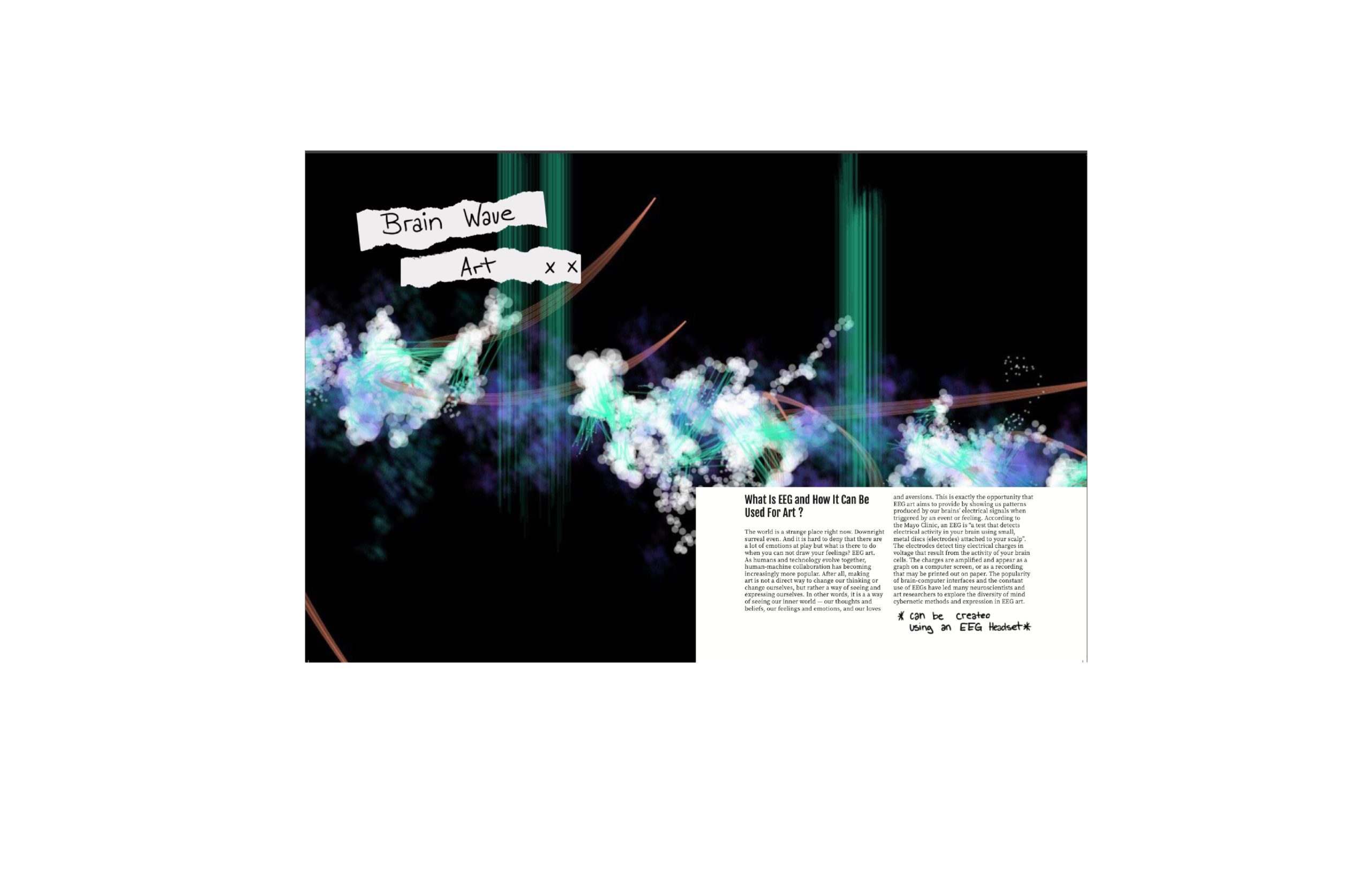
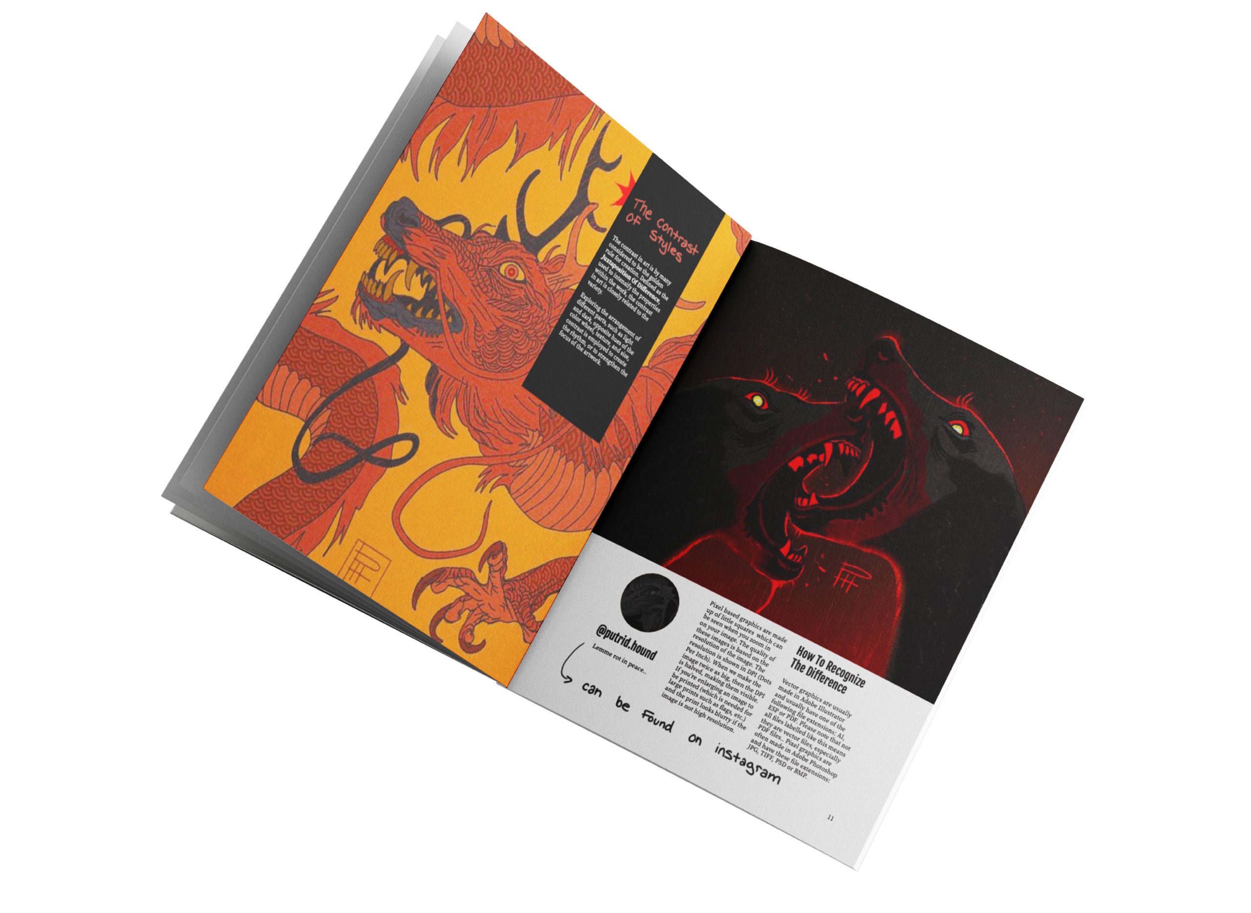
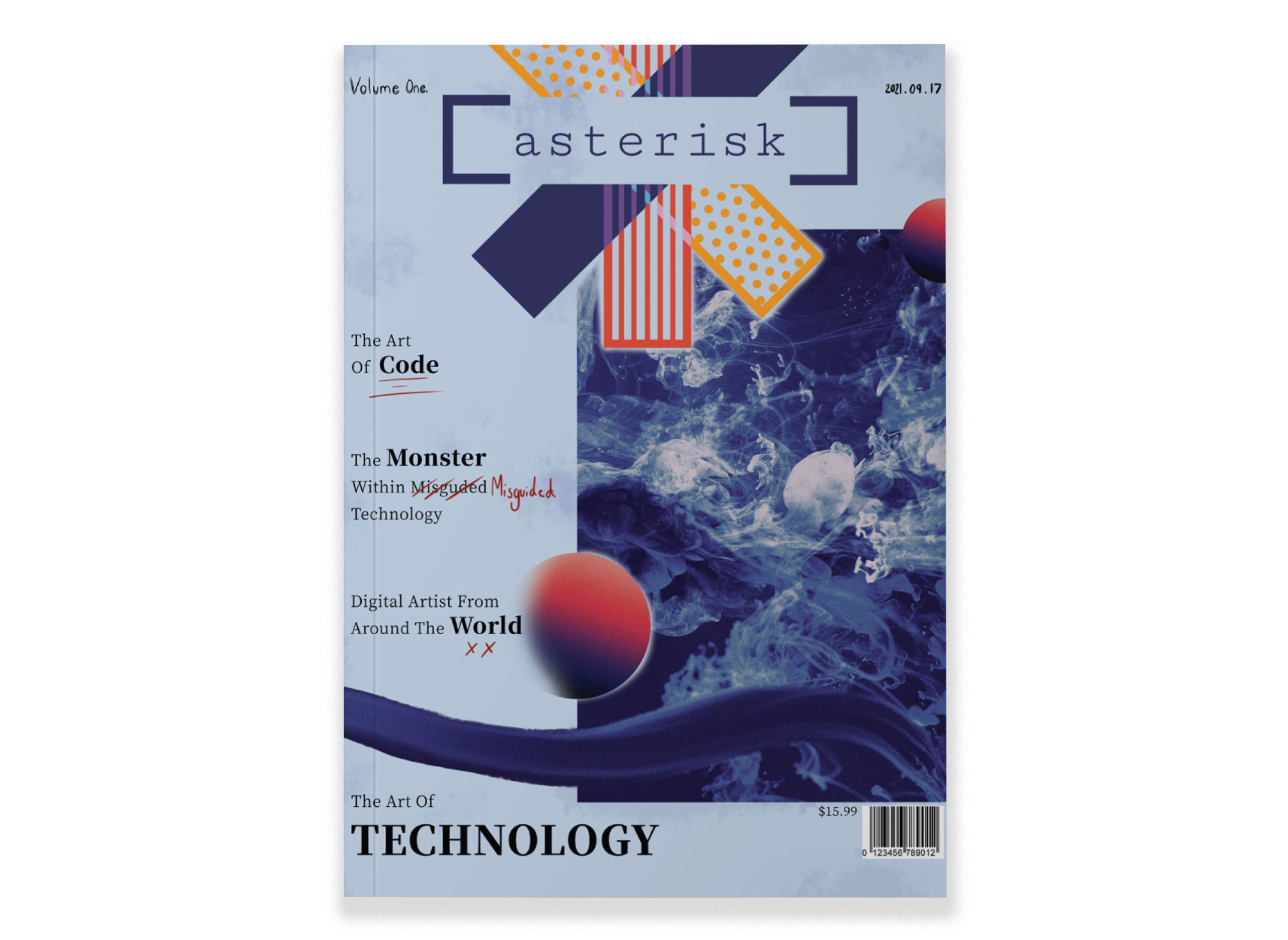
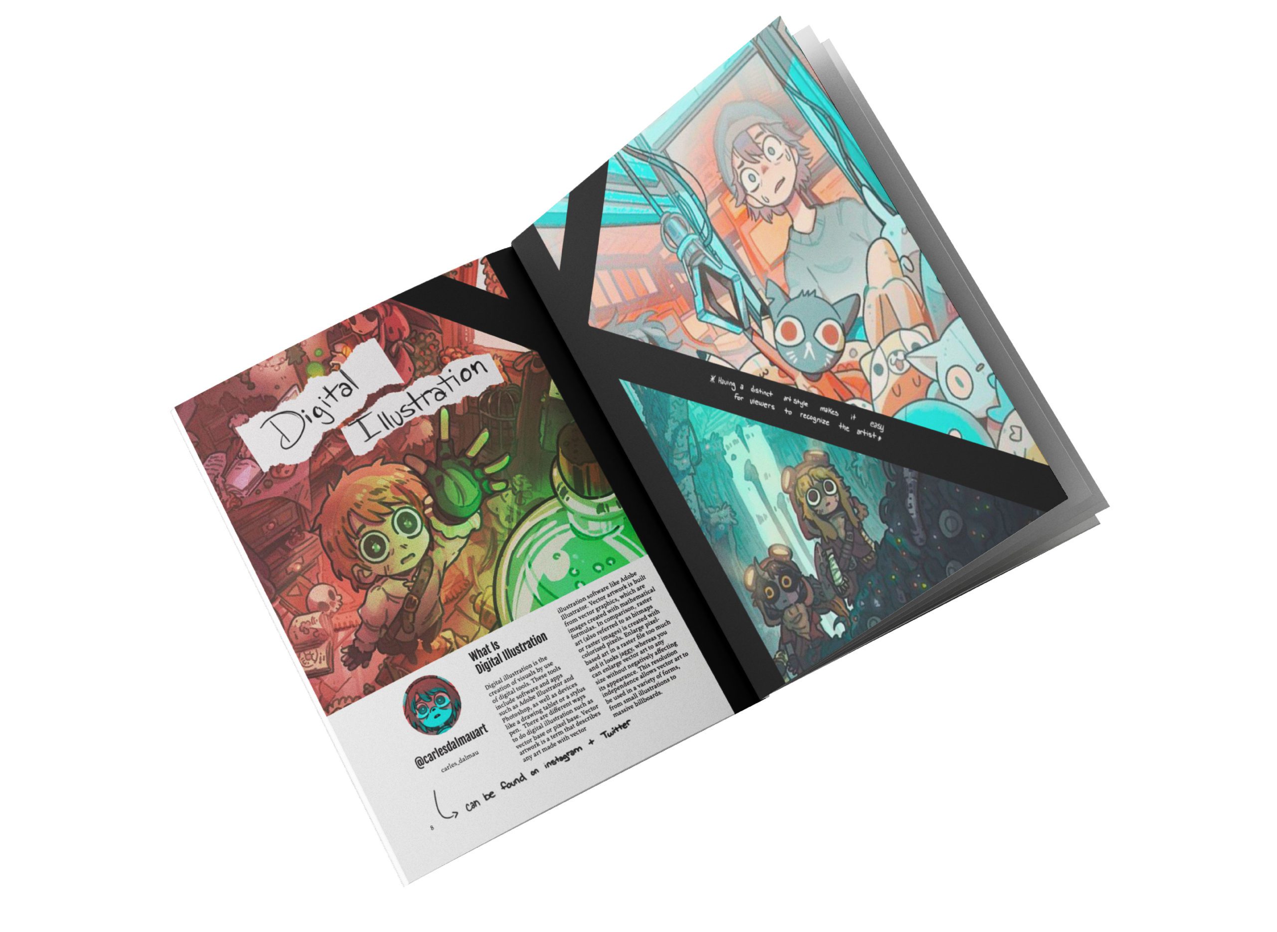
Asterisk is a digital illustration magazine. The use of primary colours, blue and red, on the front cover were used to draw the attention of the consumers while still being muted so as to not take away from the logo. The logo itself is very colourful to make it stand out against backgrounds.   The magazine is very bold visually but has aspects of traditional art scattered throughout the layouts such as hand written segments. Even with the design elements being bold it doesn’t take away from the artwork showcased in the magazine.

illustrated green flower
illustrated lime green flower used for decoration
illustrated green flower
illustrated lime green flower used for decoration

Doing What I Do Best!

Packaging
Illustrated bee in a box used for packaging
Illustration
Illustrated Bee for Illustration
Identity Branding
Illustrated bee used for identity branding

Doing What I Do Best!

Packaging
Illustrated bee in a box used for packaging
Illustration
Illustrated Bee for Illustration
Identity Branding
Illustrated bee used for identity branding

There’s A Blog Too!

illustrated lime green flower used for decoration
illustrated green flower
illustrated lime green flower used for decoration
illustrated green flower

Let’s Work Together

Menu